Create Striking Multiple Exposure Portraits Using Rigid Textures
Understanding the Synergy: Rigid Textures and Portrait Silhouettes
Look, I spent a lot of time last year chasing fluidity in my images, you know, all smooth and flowing, but honestly, lately, I’m really pulled toward things that feel solid, rigid even. That's why this whole idea of pairing harsh textures with a person's outline—their silhouette—is so fascinating right now, especially when we’re talking about doing it right there in the camera with multiple exposures. Think about it this way: you’re smashing the soft, curved reality of a human face against something like, say, the grain of concrete or maybe the repeating pattern of a brick wall. The real magic happens when you pay attention to the texture’s structure; its natural grain, measured down to the tiniest scale, dictates how sharp that final edge of the person’s shape actually looks. If you pick a texture that’s really uniform—like some brushed metal that only varies by maybe 50 nanometers across the surface—you get these incredibly clean boundaries in the final composite, which is what we want, right? And here’s a detail I keep coming back to: for the picture to really feel like it has depth, that texture needs a huge range of light and dark values, like spanning more than eight stops on the light meter, otherwise, it just blends into the skin tones instead of popping out. Maybe it’s just me, but I think the best ones happen when the texture’s contrast is extreme, that peak brightness ratio blowing out the shadows by fifteen times or more, which really locks that silhouette in place against the softer parts of the portrait. When we finally get to blending these layers, I often land on the 'Overlay' mode because it seems to keep all those tiny, sharp texture details intact better than 'Screen,' especially if the portrait wasn't super clean to begin with.
Mastering the Exposure Blend: Techniques for Seamless Overlays
Look, we talked about how rigid textures give us those sharp edges against the human silhouette, but now we have to actually glue them together without it looking like two completely separate pictures awkwardly slapped on top of each other, you know that moment when the blend just screams "two images"? Here’s what I think: when you’re using the 'Overlay' blend mode—which I lean toward because it really keeps the texture sharp—you're dealing with math that multiplies the brightness values, and for the highlights, they actually scale that product by two, which is intense. If your texture layer doesn’t have a ton of tonal information, say less than 9.5 stops of dynamic range, you’re gonna lose all that lovely detail right away because of the initial light summation happening in the camera itself. And this is critical: in Overlay, the 50% gray point acts as a pivot; anything darker than that gray in the texture mathematically darkens the portrait underneath, and anything lighter brightens it, so you can’t just throw any old mid-tone texture in there and expect it to work. Maybe it’s just me, but I always feel like I have to cheat the brightness up a bit on the texture layer first, maybe by adjusting that midpoint control by a factor of 1.2, just to stop the whole thing from looking dull once the multiplicative blending kicks in. And don't forget the light source you used to capture that texture; if you shot the concrete under some weird, narrow LED light, it’ll look flat compared to one shot under bright, full daylight because the perceived contrast difference can be huge, sometimes over fifteen percent differently in luminance. We want that texture to look like it has volume, not just printed flat on top.
Texture Selection: Choosing Rigid Elements That Enhance Narrative
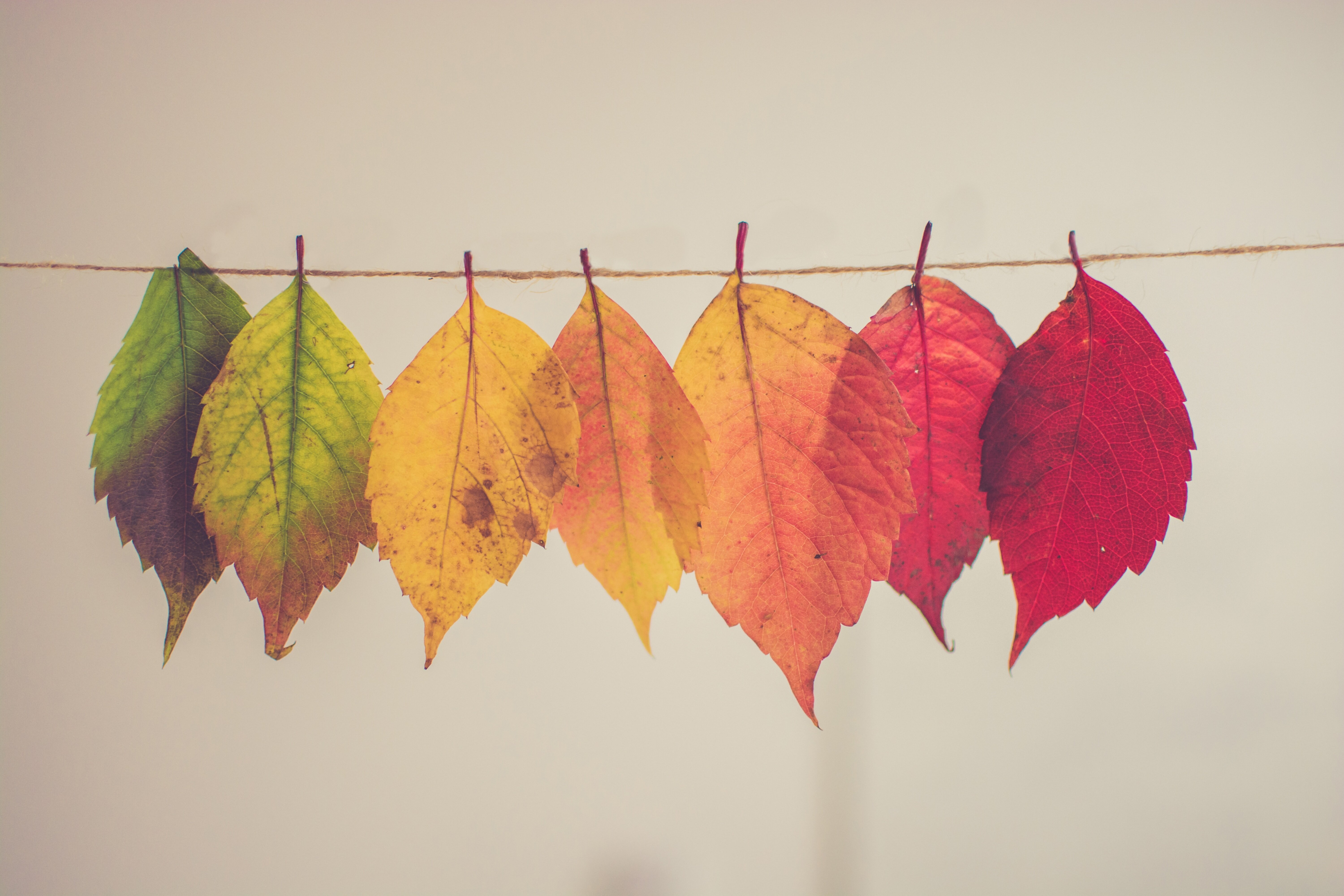
You know that feeling when you’re trying to build something—maybe it's stacking blocks or even just making a really solid sandwich—and the foundation feels kind of weak? That’s what happens if we treat texture selection in multiple exposures like an afterthought, just grabbing whatever high-contrast image is handy. Look, we’re aiming for rigid elements here, things with a clear, almost architectural structure, because those hard lines are what keep our subject’s silhouette from dissolving into mush when we layer the images. Think about the difference between using a blurry cloud texture versus, say, the sharp, repeating pattern of rusted corrugated iron; one floats away, the other grips the frame. If the texture’s grain is too fine, it just becomes a noise floor rather than a narrative element, so we really need something with visible, large-scale structure—like deep bark or the cross-hatch pattern of rebar—to actually tell a story. And honestly, the texture's own internal contrast matters immensely; if it’s all mid-tones, it won’t separate properly from the skin tones when the camera blends the light values. We need those deep, inky blacks right next to the blinding whites, often spanning more than eight stops, so the texture reads as an object itself, not just a filter washing over the portrait. We're not just adding grit; we're choosing a specific, solid language to communicate alongside the person in the frame.
Post-Processing Polish: Refining Contrast and Detail in Your Composite
Look, we’ve got this great, solid texture sitting on top of our portrait, but honestly, if the contrast is weak, the whole thing just kind of sits there, right? We need that texture to really pop off the person, and that means digging into the numbers after the initial camera blend. You know that 'Overlay' mode we like? Well, because it multiplies the brightness values—and actually scales the highlights by double—we often end up with something that looks a little flat immediately afterward, which is frustrating. I've found that dialing up the texture layer's brightness beforehand, maybe nudging that midpoint control by a factor of about 1.2, really helps counteract that dimming effect once the math settles in. And here’s the real snag: if your chosen texture didn't have a huge dynamic range to begin with, say less than nine and a half stops of actual light variation, all those tiny structural details vanish the second the camera sums the light. We really want that peak brightness ratio to be huge, something like fifteen-to-one between the lightest and darkest spots, otherwise, the texture just blends into the skin tones instead of cutting through. Remember too, that 50% gray acts like a mathematical fulcrum in Overlay; if the texture is slightly darker than that gray, it darkens the person underneath, so you have to be thoughtful about where your mid-tones fall. And don't forget how you shot the texture; a brick wall captured under some narrow LED light will look way less punchy than one shot in bright daylight, sometimes showing a fifteen percent difference in how much contrast we perceive, which completely changes the final look we’re going for.
More Posts from colorizethis.io:
- →How to transform your old black and white photos into vibrant memories with professional AI colorization
- →Experience Your Past in Full Living Color Today
- →Stop Wasting Data Science Talent The Hidden Cost of Team Silos
- →How to transform your old black and white photos into vibrant color masterpieces using AI
- →Unlock Your Images Color Potential on ColorizeThisio
- →Bringing Black and White Memories Back to Life