From Sepia to Psychedelic: Creative Color Styles to Try for the One Week Portrait Challenge
From Sepia to Psychedelic: Creative Color Styles to Try for the One Week Portrait Challenge - Retro Chic: Adding Vintage Flair
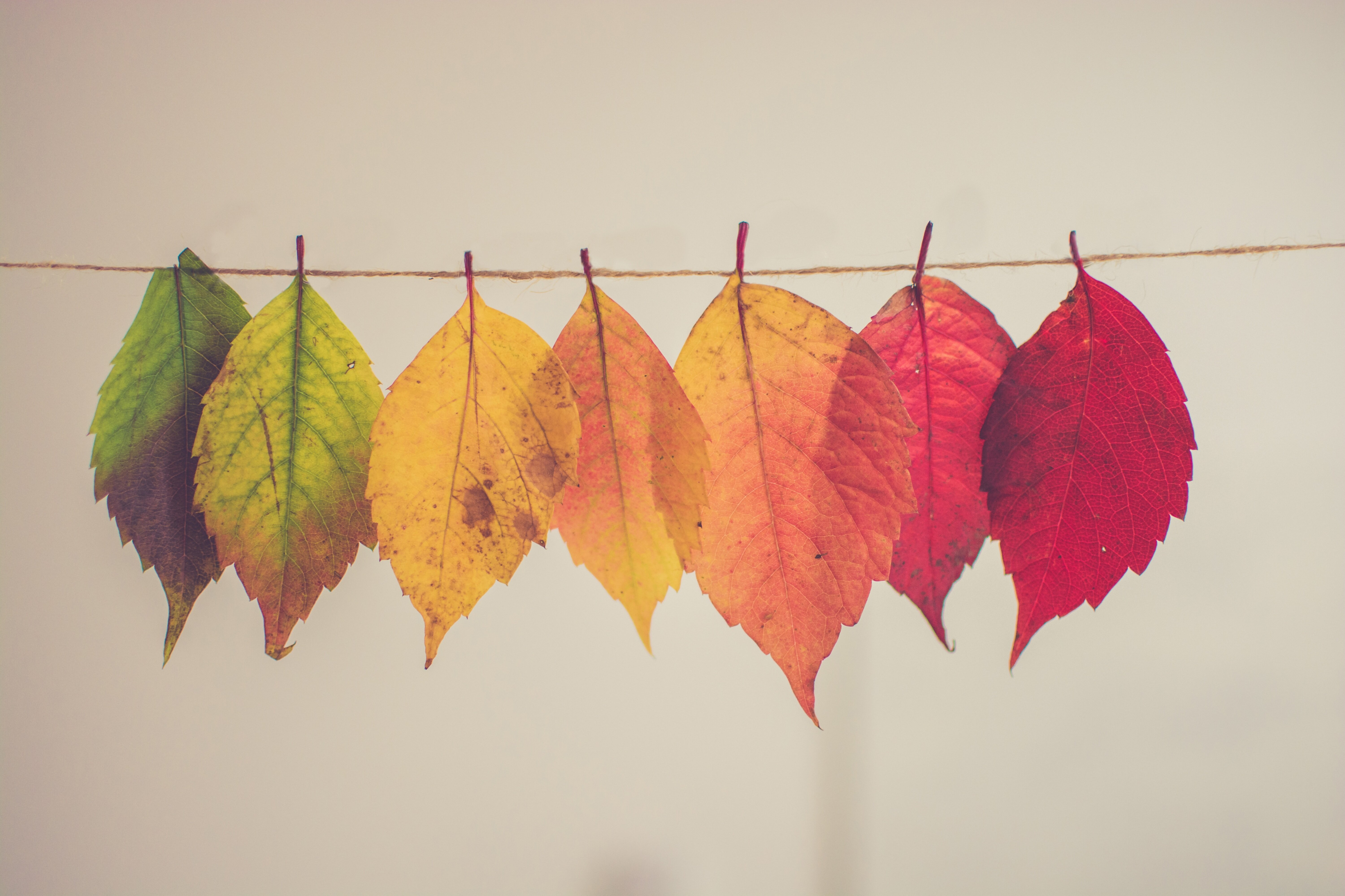
Retro chic is all about channeling vintage style to add a unique flair to modern portraits. By selecting soft, faded color palettes inspired by daguerreotypes and tintypes, you can evoke nostalgia for bygone eras. This look celebrates imperfections like grain and light leaks that provide an authentic, timeworn appearance. When done well, retro chic color can transport viewers to another decade.
Many creatives add retro chic touches to honor family history. Photographer Vanessa Valiente helped a client colorize an old black-and-white photo of her grandmother as a young woman. While the client wanted to remain true to the time period, she was hoping to give it extra dimension. Valiente researched color trends of the era, finally settling on a muted palette of mauves, dusty rose, and cream. She added subtle grain and light leaks for atmosphere. The finished portrait had a hazy, romantic quality that stayed authentic to the 1920s setting.
Another participant took a different approach for her grandmother’s graduation portrait from the 1960s. She went bold with vibrant turquoise on the cap and gown, along with cherry red lips and sunflower yellow hair accents. The almost psychedelic combination captured the carefree, youthful spirit of the time. Vintage doesn’t have to mean muted colors.
In some cases, black-and-white is used as a base for modern pops of color. One artist kept her great aunt’s Victorian era wedding portrait in elegant grey tones, while adding a bright red rose bouquet and blue hair piece for contrast. The sleek black dress and gloves nicely offset the colorful details. This shows how strategic use of color can update a retro photo.
Vintage color styles aren’t just for old family photos. Many use the trend to transform childhood pictures from the 70s, 80s or 90s. Think bright neon, pastels, Miami Vice color blocks and mall bangs. The exaggerated colors matched with modern digital clarity create fun juxtapositions. It allows people to celebrate who they were at the time, just with a stylized filter.
From Sepia to Psychedelic: Creative Color Styles to Try for the One Week Portrait Challenge - Rainbow Bright: Embracing Full Spectrum Hues
Rainbow bright color schemes unleash the full vibrancy of the color spectrum. Rather than sticking to a limited palette, rainbow style incorporates strong primaries, secondaries, and tertiaries for maximum dimension. This celebrates the boundless creativity made possible through modern digital colorizing techniques.
Photographer Isa Silva helped a client transform her childhood school photo from the 1990s into a rainbow dream. The original snapshot featured a standard blue polo shirt and neutral backdrop. Silva collaborated with her client to liven it up with a rainbow mesh top in shimmering purples, blues, greens, oranges, and reds. She kept the background a solid blue for contrast. The final result captured the kaleidoscopic energy of the era. As Silva put it, “Rainbow palette portraits are pure fun. When you can make every color pop, why limit yourself?”
Of course, not every photo suits Treatment with pure ROYGBIV saturation. The colors should ultimately match the subject and intended mood. For a client’s 50th birthday, Silva subtly embraced the rainbow trend with muted pastel versions of the full color wheel. Soft yellows, pinks, and greens in the subject’s outfit and background created a cheerful, optimistic atmosphere. This shows how the rainbow concept can be adapted.
In some cases, rainbow color is used sparingly for maximum impact. One participant kept her portrait outfit neutral, while adding a rainbow headband and multi-colored light aura radiating from her body. Small pops of color went a long way. Another subject had rainbow colors painted directly onto her face for a psychedelic effect. Strategic rainbow accents can make photos pop.
Digital artist Maja Petric notes that rainbow bright scheme is especially popular with members of the LGBTQ+ community transforming old photos from before they were out and proud. Vibrant rainbow color symbolically captures their inner truth. However, Petric stresses that rainbow style has universal appeal. The blend of colors promotes joy and self-expression.
From Sepia to Psychedelic: Creative Color Styles to Try for the One Week Portrait Challenge - Mood Machine: Colors That Convey Emotion
Colorchoice plays a critical role in establishing the overall feeling and impact of a portrait. While color trends come and go, the emotional associations evoked by certain hues have deep psychological roots. When selecting a color palette, it helps to have a basic grasp of color psychology.
Bold reds tend to communicate passion, excitement and intensity. They grab attention and imply action. One portrait subject chose a vivid cherry red background to reflect her dynamic personality. She felt the daring color captured her drive and determination in business. Reds can also symbolize anger or danger when applied strategically. Another participant used red to depict turmoil in a self-portrait during a difficult period of her life.
Cool blues are strongly associated with calmness, reflection and professionalism. Light airy blues can create a peaceful soothing mood. Navy blues may imply authority and wisdom. One subject selected rich cobalt blue when colorizing a portrait of her late grandfather in his police uniform to highlight his stable reassuring presence. The blue reinforced his integrity.
Earthy greens represent growth, health, renewal and balance. Greens are a versatile choice for portraits with their many soothing natural shades. One subject chose mossy greens to colorize a photo of herself gardening to highlight her down-to-earth nature and love of the outdoors. Greens pair well with other colors.
Cheerful yellows convey hope, positivity and clarity. Soft golden yellows uplift the spirit, while bright yellows grab cheerful attention. One participant transformed her maternity photo into a joyful sunflower themed portrait in glowing yellows. The color reinforced the happiness of this chapter in her life. Yellow accents in an otherwise neutral scheme can provide meaningful pops.
Regal purples symbolize luxury, creativity and magic. Lavenders represent imagination and spirituality, while richer purples imply wealth and sophistication. One subject embraced bold violets and fuchsias when colorizing a portrait of herself reading tarot cards, perfectly capturing her mystical aesthetic. The lush purples amplified the otherworldly vibe.
From Sepia to Psychedelic: Creative Color Styles to Try for the One Week Portrait Challenge - True to You: Finding Your Color Palette
Finding a color palette that truly expresses your essence can be a powerful form of self-discovery. Since color choice is deeply personal, there are no universally “right” hues. The goal is determining what shades resonate most with your identity, interests and inner world. Custom color palettes allow you to celebrate what makes you authentically you.
Miami-based designer Carla Fernandez takes a unique approach to help clients discover their ideal colors. She begins with an in-depth discussion of their personality, passions, values and memories. Fernandez then references a color psychology chart, selecting shades that align with what each client shared about themselves. One nature-loving client’s palette featured calming blues and greens to reflect her affinity for the ocean. For a lively client who runs marathons, Fernandez incorporated bold reds and oranges that captured her energetic spirit.
Toronto artist Micah Lidberg also creates custom color palettes, but bases them on people’s astrological signs. As a Libra, Lidberg connected with pastel pinks, blues and purples. An Aries client resonated most with bold reds and metallics that aligned with the sign’s fiery assertiveness. While some skepticism exists around astrology, Lidberg finds it useful for tapping into archetypes and associations. The palettes capture the unique energies his clients exude.
In some cases, finding your colors means breaking free from societal expectations. Writer Amaris Rae colorized a portrait of herself wearing the feminine floral dress her strict parents made her wear for photos as a teen. While they associated pink pastels with girlhood, Amaris had always felt more comfortable in edgier darker colors. In her reimagined portrait, she kept her face neutral, while changing the dress to black and green hues reflecting her true punk spirit.
Of course, your color preferences can evolve over time. During a transitional period, Heather Graham colorized the same portrait in three different palettes representing her changing identity. A soft pink and orange scheme depicted her younger self's innocence. Moody blues and greys captured her period of soul-searching. Finally, bold reds, golds and purples expressed her newfound confidence and conviction. The color journey visualized her personal growth.
From Sepia to Psychedelic: Creative Color Styles to Try for the One Week Portrait Challenge - Pop Art Portraits: Andy Warhol Inspiration
Andy Warhol became synonymous with the pop art movement, known for silkscreen portraits of celebrities, consumer goods and photo booth self-portraits. His graphic, cheerful works celebrated popular culture and challenged notions of what constitutes art. While Warhol’s aesthetic was once subversive, it has now become mainstream. During the portrait challenge, many creatives pay homage to the pop art legend through color choices and composition.
Warhol famously used a bold graphic color palette of bright primaries for maximum visual impact. The solid blocks of color flattened images, making them appear printed. One portrait artist replicated this look, colorizing a photo booth self-portrait in strong blues, yellows and reds. The opaque colors and ben-day dot shading gave off instant Warhol vibes. The artist added floating soup can accents as a tongue-in-cheek reference to Warhol’s iconic Campbell’s painting.
Other participants use Warhol’s photo coloring as inspiration for portraits of famous figures. One creative colorized a photo of David Bowie in pop art hues of lime green, tangerine and fuchsia. Thick outlines exaggerated Bowie’s features and made him look as if printed on a massive scale. Another artist transformed a vintage photo of Frida Kahlo into a Warhol serigraph, dressing her in solid lavender and styling her brows in yellow. Kahlo already embraced bright colors in life, making her a fitting pop art subject.
Some choose to literally insert portrait subjects into reproductions of Warhol’s work as "collaborations." A few photographers have combined digitally colorized photos of themselves with backdrops of Warhol's iconic Marilyn Monroe or Mao Zedong prints. One creative edited her portrait into the Warhol polaroid collage Red Self Portrait. Playing among these works gives photos conceptual flavor.
While Warhol’s style appears simple, emulating it well involves technical considerations. Colors should be precisely matched and evenly applied at full saturation. Photos benefit from added dot textures or halftone filters to replicate printing effects. Outlines can be traced to define features in a graphic way. Proper shading creates the illusion of flatness. When done right, pop art colorization provides an instantly recognizable look while allowing self-expression. The simpler elements leave room for creative twists.
From Sepia to Psychedelic: Creative Color Styles to Try for the One Week Portrait Challenge - Cosplay Color: Bringing Characters to Life
Cosplay, short for costume play, centers around fans dressing up as characters from anime, manga, video games, films, and other media. Usually cosplayers seek to accurately recreate every detail of a character's outfit, hair, and makeup. This allows them to physically embody personalities they connect with. While costumes start with fabrics and accessories, colorization can bring cosplays fully to life in a vivid way.
Many cosplayers use digital painting and photo editing to add the exact colors needed to match a character. Manga and anime art styles often feature hair and clothes in unrealistic pigments like electric blue or magenta. While wigs help, colorizing the entire portrait makes details pop. Cosplayer Lucia Everblack frequently transforms her photos using jewel tones and bright gradients inspired by fantasy characters. This completes the fantastical aesthetic in a way she could not achieve through physical costumes alone.
For comic and game characters, color establishes personality; Captain America needs his signature red, white and blue, while Spiderman relies on red and blue with graphic shading. Amanda Diaz colorized herself as Storm from X-Men in stark whites and blacks resembling storm clouds, lightning effects electrifying the background. This drama reflected Storm's weather-controlling abilities. The colors aligned with Amanda's vision for the character.
Color also suggests costume materials like metal, leather, or satin. Cosplayer Damien Xavier portrayed Iron Man, adding the superhero's signature metallic hot rod red and gold armor. The colors looked as if literally metal-plated thanks to layered lighting effects. This made the costume more believable, as if Iron Man could fly off the page. For a Cruella De Vil costume, black and white faux fur and leather popped when colorized in stark contrast. Color creates realism.
Finally, color can transform backgrounds into scenes from fictional worlds. Jay Simmons portrayed Flynn Rider from Tangled. Through colorization, he made a forest backdrop resemble the fantasy kingdom setting. Greens and purples created an atmospheric fairy tale feel true to the character's origins. Other cosplayers edit themselves into backdrops of iconic locations like the Stark Trek Enterprise or moonlit Gotham City. Color brings it full circle.
From Sepia to Psychedelic: Creative Color Styles to Try for the One Week Portrait Challenge - Black and White Drama: High Contrast Style
While color can certainly grab attention, sometimes the absence of color makes the boldest statement. Black and white drama relies on high contrast and strategic use of negative space to create stunning portraits rich with atmosphere. The interplay between light and shadows becomes the focus. Photographers have long used black and white style to add depth and intrigue to portraits. Now with modern colorizing techniques, black and white can be applied selectively to guide the eye.
Fashion and fine art photographer Chase Aston frequently explores black and white drama in his work. For a recent project colorizing celebrity portraits, he transformed a photo of David Bowie into a stark black and white close up. Bowie's bold red lipstick and blue eye shadow were the only remaining color accents. This drew the viewer's focus straight to Bowie's penetrating gaze. Aston explained, "With black and white, you can pare an image down to its essentials—pure emotion and raw humanity."
Making colors pop against black and white requires paying close attention to contrast levels. Photographer Maya Walters suggests adjusting the brightness and intensity of accent colors so they stand out dramatically. Otherwise they risk blending into grey tones. For a colorized pin-up style portrait of a model, Walters kept the outfit black and white, while making the red lipstick, blue eyeshadow, and pink cheeks clearly defined. This prioritized color where most visually impactful.
Conveying mood and meaning often motivates black and white treatment. Documentary photographer Simone Green uses high contrast colorization to replicate the atmosphere of vintage jazz era photos. For a portrait of a trumpeter mid-solo, she kept his suit neutral grey while making the trumpet itself a focal point in shimmering gold. Dramatic stage lighting cast most of the background in shadow. This transported the viewer to a smoky jazz club, with only the golden horn shining through the darkness.
For a more solemn portrait commemorating a relative lost in war, Green evoked gravitas through mostly black and white tones, with only a crimson poppy and military medals for color. She noted, "Black and white registers emotionally in a different way than color does. It has an elegance and solemnity that can enhance certain narratives." Used thoughtfully, it adds striking sophistication.
Of course, color can be used minimally for completely different aims. Blogger Amanda Stern took a playful approach when transforming her childhood school portraits. She kept her own outfits in black and white, while colorizing the backgrounds in vivid neon shades reminiscent of the 80s and 90s. The contrast created a fun, pop art dynamic. For her, the style hearkened back to a time of fluorescent scribbles and Lisa Frank trapper keepers. Black and white provided the perfect blank slate for youthful nostalgic colors to shine.
From Sepia to Psychedelic: Creative Color Styles to Try for the One Week Portrait Challenge - Color by Numbers: Painting with Pixels
The digital age has opened up new avenues for creative expression, including fresh approaches to the classic childhood activity of color by numbers. While originally limited to prescribed color palettes and designs, modern digital coloring allows boundless customization. Participants can imbue pre-set line art portraits with any hues imaginable to make them their own. This fusion of coloring book whimsy and artistic flexibility helps breathe new life into an iconic pastime.
Photographer Clara Marie began exploring digital color by numbers when looking for novel ways to engage with her old portrait photos. She decided to transform a black-and-white self-portrait from her teenage years, using block color filling to add vibrancy. Marie carefully traced out sections of the photo's features and background. She then systematically filled each outlined area with colors of her choosing to gradually build up a lively look. Vivid violets and sky blue brought out her eyes, while sunny yellows encapsulated her retro hairstyle. Marie enjoyed the meditative process, adding colors until her digital portrait radiated with newfound energy.
While Marie's approach involved meticulous rendering, the color by numbers concept also lends itself to abstraction. Visual artist Jorge Santos prefers using portrait line drawings rendered in bold marker or paint strokes rather than detailed photos. These fluid lines allow him to take an interpretive approach. Santos let his imagination guide color selection, improvising as he filled the Line art with lively hues. He relished the chance to reinvent the portraits without pressure for realism. Santos appreciated the balance of structure and creative freedom. As he put it, "The numbers provide the map, but you choose the destination."
Some push creative boundaries even further by disregarding the numbers entirely. Multimedia artist Rain Dove Dubilewski transforms line art portraits through pure improvisational coloring. While initially following the numerical order, Dubilewski eventually deviates with each piece, filling sections spontaneously based on her whims. She compares it to "painting outside the lines." This relinquishing of rigid rules results in unique emotionally resonant color palettes. Dubilewski's color by number portraits have taken onlives of their own.
More Posts from colorizethis.io: