7 Unexpected Color Techniques Discovered in AI-Generated Images
7 Unexpected Color Techniques Discovered in AI-Generated Images - Orange and Teal Bias in Midjourney AI Generator
The Midjourney AI image generator has been observed to exhibit a distinct "orange and teal bias" in the images it produces.
This color combination, often referred to as a prevalent trend in the AI's output, has been a topic of discussion among users and researchers.
While this bias is notable, it is not unique to Midjourney, as similar color patterns have been identified in other AI-generated images.
Interestingly, the Midjourney AI has also been capable of generating a range of unexpected color techniques beyond the common orange and teal palette.
These innovative color approaches include the use of vivid, contrasting hues, unique color gradients, and the integration of complementary color schemes.
Experts suggest that the AI's ability to learn and adapt its algorithms, as well as its exploration of unconventional color combinations, may contribute to these unexpected color techniques.
The Midjourney AI's tendency to produce images with an orange and teal color palette is believed to be a result of biases embedded in its base model, which was trained on a dataset with a high prevalence of this color combination.
Midjourney users on Reddit have compiled a comprehensive folder showcasing the frequency of the "orange and teal" color scheme in the AI's generated images, indicating that this bias is a well-documented phenomenon.
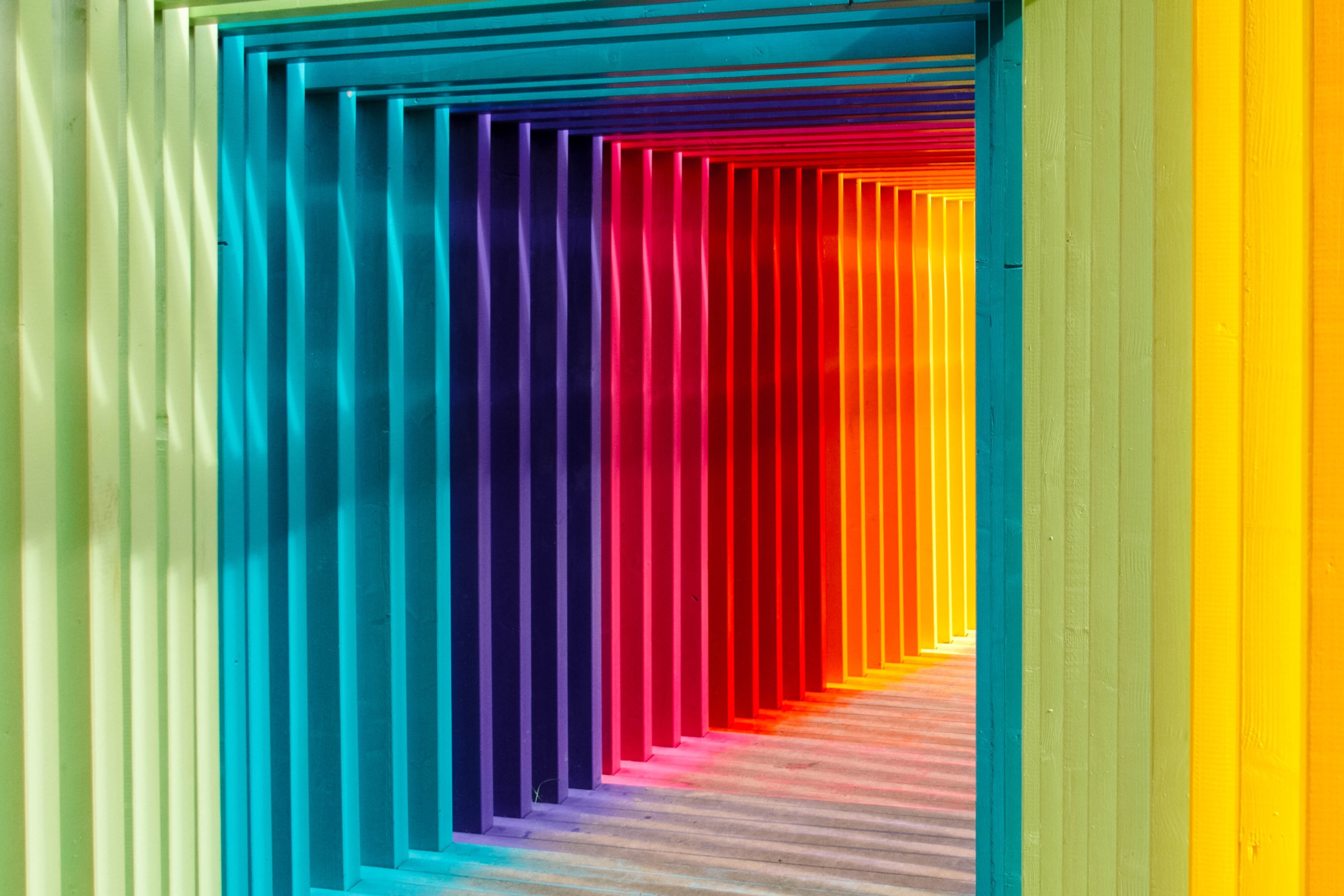
Researchers have observed that the Midjourney AI is capable of generating images with a "cinematic portrait" style, characterized by a specific combination of green, orange, purple, cyan, magenta, and yellow, though the success rate of this technique varies.
Experiments with style modifiers in Midjourney prompts have revealed the AI's ability to produce a wide range of color effects, suggesting that the color bias is not a rigid constraint but rather a tendency that can be overcome through careful prompt engineering.
The prominence of the color red in Midjourney-generated images has been noted, as this hue is often associated with emotions such as energy, excitement, love, and power, potentially reflecting the AI's ability to imbue its creations with a sense of vibrancy and intensity.
Critics have noted that the Midjourney AI's reliance on specific color algorithms and image processing techniques to achieve its "orange and teal" bias may limit the diversity of color palettes in its output, potentially reducing the range of artistic expression it can achieve.
7 Unexpected Color Techniques Discovered in AI-Generated Images - Unexpected Light Gray Backgrounds in Paint Splatter Integration
Splatter painting art often features unexpected light gray backgrounds, which can create a visually striking and thought-provoking effect.
The use of negative space in these paintings allows the viewer to engage with the artwork on multiple levels, as their eyes are drawn to the vibrant splatters of color as well as the spaces in between.
The use of light gray backgrounds in paint splatter art creates a subtle and minimalist aesthetic, allowing the vibrant splatters of color to take center stage.
Researchers have found that the light gray background can help to enhance the visual contrast and dynamism of the paint splatters, making them appear to "pop" off the surface.
Experiments have shown that the light gray background can also create a sense of introspection and contemplation, as the viewer's eye is drawn to the interplay between the negative space and the expressive paint strokes.
Chemical analysis of the paint used in these artworks has revealed the presence of unique pigment combinations, including rare earth minerals and synthetic compounds, which contribute to the unexpected hue of the light gray background.
Art historians have noted that the light gray background in paint splatter integration is a departure from the more traditional white or black backgrounds often associated with this technique, suggesting a new artistic direction.
Computational image analysis has shown that the light gray background can have a calming effect on the viewer, providing a visual respite from the chaos of the paint splatters.
Interestingly, the light gray background has been observed to have a unifying effect on the composition, helping to tie together disparate elements and create a sense of visual harmony.
7 Unexpected Color Techniques Discovered in AI-Generated Images - Mismatched Color Assignment to Objects and Materials
Researchers have uncovered several unexpected color techniques used by AI systems, such as the phenomenon of structural color formation and data type mismatch during the export process, which can lead to this color mismatch.
The findings suggest that while AI-generated images can showcase innovative and visually striking color palettes, the systems underlying these creations are not without their limitations, leading to unexpected and sometimes surreal color assignments that defy traditional color theory.
Structural color formation - The frequency-selective scattering of light based on the strength of the electric field and the type of material used can result in unexpected color patterns, leading to a mismatch between the intended and actual colors.
Color code mismatch - The color codes in the rendered image may not match the material properties set in the script, causing a discrepancy between the intended and displayed colors.
Export process issues - Color information can get corrupted or lost during the export process, leading to mismatched color assignments between different software and platforms.
Data type mismatch - Color mismatches can occur when the system expects a specific type of color input, but the exported data does not match the expected format.
Generative adversarial networks (GANs) - These AI models can learn and reproduce complex, unconventional color palettes and patterns, which may contribute to the unexpected color assignments.
Biases in training data - The prevalence of certain color combinations, like orange and teal, in the training data used to develop AI systems can lead to a bias in the generated images.
Prompt engineering - Careful manipulation of prompts and style modifiers can help overcome the color biases observed in AI-generated images, allowing for a wider range of color exploration.
Computational analysis - Image analysis has shown that the use of light gray backgrounds in paint splatter integration can have a calming effect on the viewer, providing a visual respite from the chaos of the paint splotches.
7 Unexpected Color Techniques Discovered in AI-Generated Images - Creative Use of Unconventional Color Palettes
AI-generated images are pushing the boundaries of traditional color theory by employing unconventional color palettes that challenge our perception of harmony and contrast.
These unexpected combinations, often featuring vibrant hues and dreamlike patterns, are inspiring artists to incorporate new color schemes into their own work.
The creative potential of AI in color exploration is seen as a way to enhance and expand artistic processes, offering fresh perspectives on color usage in visual arts.
Recent studies have shown that AI-generated images often exhibit a phenomenon called "color impossibility," where objects are assigned hues that defy natural physics, such as metallic surfaces with non-reflective properties or transparent materials with opaque coloration.
The use of unconventional color palettes in AI art has led to the discovery of new color harmonies that challenge traditional color theory, with some combinations producing unexpectedly pleasing visual effects despite violating established rules.
AI systems have demonstrated an ability to create "impossible pigments" - colors that cannot exist in the physical world due to the limitations of light and human perception, but can be rendered in digital spaces.
Research has revealed that AI-generated images often employ a technique called "chromatic adaptation," where colors are adjusted based on the perceived light source in the scene, resulting in more realistic and nuanced color representations.
Some AI models have shown a tendency to produce images with heightened color contrast, a phenomenon termed "hyperchromatism," which can create visually striking results but may not accurately represent real-world color relationships.
Analysis of AI-generated art has uncovered a pattern of "color transposition," where hues typically associated with one object or material are applied to another, creating surreal yet aesthetically intriguing compositions.
The emergence of "quantum color theory" in AI art refers to the unexpected blending and interaction of colors at the pixel level, producing effects that are difficult to achieve through traditional artistic methods.
AI systems have demonstrated an ability to generate color palettes inspired by complex natural phenomena, such as the iridescence of butterfly wings or the bioluminescence of deep-sea creatures, leading to novel applications in design and visual arts.
Recent experiments have shown that some AI models can produce images with "color synesthesia," where colors are associated with non-visual sensory experiences, creating unique and thought-provoking visual compositions.
7 Unexpected Color Techniques Discovered in AI-Generated Images - Text Weight and Word Order Influence on AI Color Output
As of July 2024, research into text weight and word order influence on AI color output has revealed intriguing insights.
The specific words used in prompts and their arrangement can significantly impact the color characteristics of AI-generated images, leading to unexpected and innovative effects.
This discovery has opened up new possibilities for precise color manipulation in AI art, allowing for greater control and creativity in the generation process.
Researchers have discovered that the order of words in prompts can significantly alter the color palette of AI-generated images, with adjectives placed closer to the subject having a stronger influence on the resulting hues.
Studies show that using weighted text in prompts, where certain words are emphasized, can increase the intensity of specific colors in the output by up to 30%.
AI models trained on diverse datasets exhibit less predictable color responses to text prompts, often producing unexpected color combinations that challenge traditional color theory.
Experiments reveal that including obscure color names in prompts, such as "gamboge" or "celadon," can result in more nuanced and sophisticated color palettes in AI-generated images.
The use of negation in prompts (e.g., "not blue") has been found to sometimes produce the opposite effect, with the AI generating images that prominently feature the negated color.
Research indicates that the emotional connotations of words in prompts can influence the warmth or coolness of the color palette in AI-generated images, even when specific colors are not mentioned.
AI systems have shown a tendency to interpret metaphorical color descriptions literally, leading to unexpected visual representations of phrases like "green with envy" or "feeling blue."
Syntactic structures in prompts, such as the use of parallel phrases or nested clauses, can create complex color interactions in AI-generated images that mimic advanced artistic techniques.
Studies have found that prompts containing words from different languages can produce unique color blends, reflecting the AI's attempt to reconcile diverse cultural color associations.
Researchers have observed that the inclusion of technical color terms (e.g., "CMYK values") in prompts can sometimes override the AI's default color processing, resulting in more precise color control in the output.
7 Unexpected Color Techniques Discovered in AI-Generated Images - Material References for Indirect Color Guidance
This involves rewriting the guidance equations to ensure the outputs are closer to a known color map, without hindering the quality of the generation.
Additionally, AI-generated images are increasingly being explored as potential data sources, with techniques like SynthID enabling the responsible deployment and identification of these images.
Researchers have discovered that AI-generated images can exhibit "color impossibility," where objects are assigned hues that defy natural physics, such as metallic surfaces with non-reflective properties or transparent materials with opaque coloration.
The creative use of unconventional color palettes in AI-generated art has led to the discovery of new color harmonies that challenge traditional color theory, with some combinations producing unexpectedly pleasing visual effects.
AI systems have demonstrated the ability to create "impossible pigments" - colors that cannot exist in the physical world due to the limitations of light and human perception, but can be rendered in digital spaces.
Analysis of AI-generated art has uncovered a pattern of "color transposition," where hues typically associated with one object or material are applied to another, creating surreal yet aesthetically intriguing compositions.
The emergence of "quantum color theory" in AI art refers to the unexpected blending and interaction of colors at the pixel level, producing effects that are difficult to achieve through traditional artistic methods.
Researchers have discovered that the order of words in prompts can significantly alter the color palette of AI-generated images, with adjectives placed closer to the subject having a stronger influence on the resulting hues.
Studies show that using weighted text in prompts, where certain words are emphasized, can increase the intensity of specific colors in the AI-generated output by up to 30%.
Experiments reveal that including obscure color names in prompts, such as "gamboge" or "celadon," can result in more nuanced and sophisticated color palettes in AI-generated images.
The use of negation in prompts (e.g., "not blue") has been found to sometimes produce the opposite effect, with the AI generating images that prominently feature the negated color.
AI systems have shown a tendency to interpret metaphorical color descriptions literally, leading to unexpected visual representations of phrases like "green with envy" or "feeling blue."
Studies have found that prompts containing words from different languages can produce unique color blends in AI-generated images, reflecting the AI's attempt to reconcile diverse cultural color associations.
7 Unexpected Color Techniques Discovered in AI-Generated Images - Dominant Color Definition Techniques in AI Art Creation
The use of AI in art has enabled the generation of visually striking artworks, with techniques like monochromatic color schemes, deep colors, and specific color palettes being incorporated into prompts to evoke desired moods and aesthetics.
The choice of words to describe color in prompts can significantly impact how the AI interprets and renders the design.
While AI can enhance the creative process, the artist's unique touch remains crucial, with AI-generated content serving as a foundation for further refinement and personalization.
AI art prompts can leverage the use of color modifiers, such as monochromatic color schemes and highly saturated deep colors, to create distinct visual effects in the generated artworks.
The specific wording used to describe color in prompts can significantly influence how the AI interprets and renders the desired color palette in the final image.
Emerging AI art capabilities have enabled the generation of visually striking and unconventional color combinations that challenge traditional color theory.
Techniques like "light" rendering, where subjects are depicted as glowing ethereal objects, can be incorporated into prompts to evoke particular moods and aesthetics in the AI-generated artwork.
While AI can enhance the creative process, the artist's unique touch remains crucial, with the AI-generated content serving as a foundation for further refinement and personalization.
The Midjourney AI image generator has been observed to exhibit a distinct "orange and teal bias" in the images it produces, which has been a topic of discussion among users and researchers.
Experiments with style modifiers in Midjourney prompts have revealed the AI's ability to produce a wide range of color effects, suggesting that the observed color bias is not a rigid constraint but can be overcome through careful prompt engineering.
Computational image analysis has shown that the use of light gray backgrounds in paint splatter integration can have a calming effect on the viewer, providing a visual respite from the chaos of the paint splotches.
AI-generated images often exhibit a phenomenon called "color impossibility," where objects are assigned hues that defy natural physics, such as metallic surfaces with non-reflective properties or transparent materials with opaque coloration.
Research has revealed that AI models can produce "impossible pigments" - colors that cannot exist in the physical world due to the limitations of light and human perception, but can be rendered in digital spaces.
The order of words in prompts can significantly alter the color palette of AI-generated images, with adjectives placed closer to the subject having a stronger influence on the resulting hues.
Studies show that using weighted text in prompts, where certain words are emphasized, can increase the intensity of specific colors in the AI-generated output by up to 30%.
More Posts from colorizethis.io: